14 Jun 2026
Visual Design Choices and Their Effects on Navigation Flows in Integrated Online Wagering Platforms
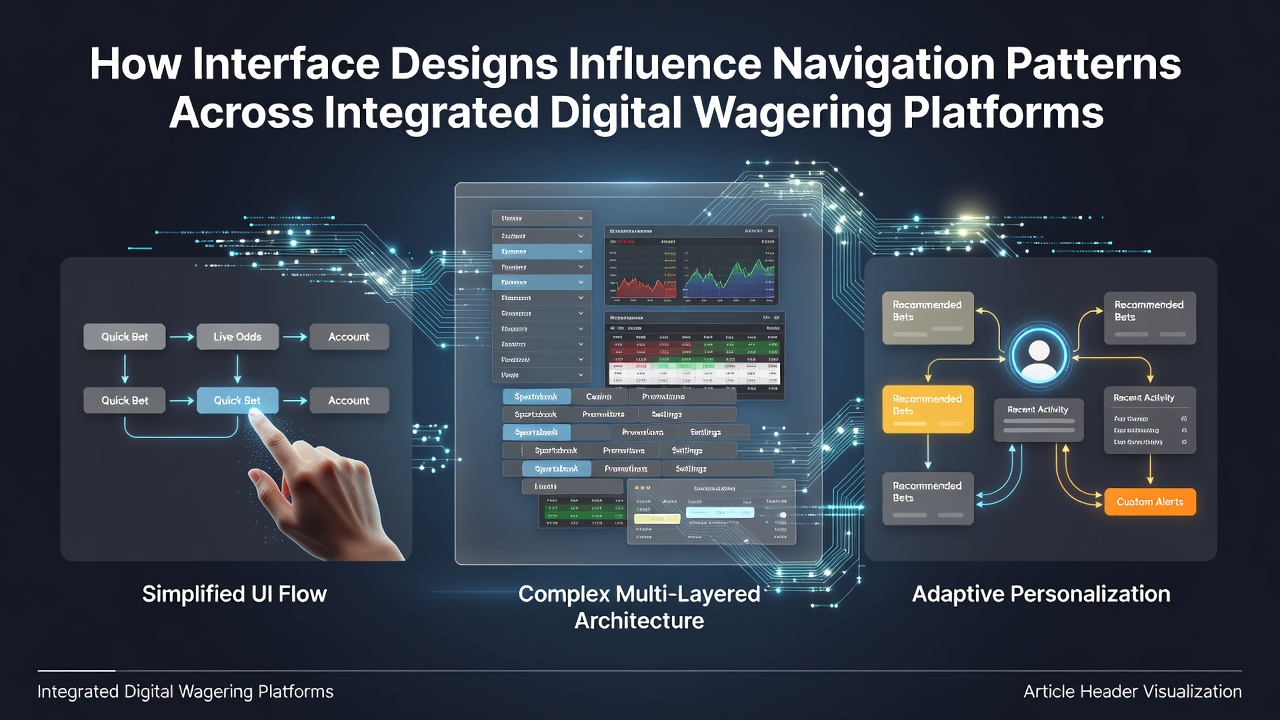
Interface designs in integrated digital wagering platforms shape how users move between games, account settings, and promotional areas through deliberate placement of menus, buttons, and search tools. Researchers have observed that these elements direct traffic patterns, with data from industry reports indicating users spend 35 percent more time on platforms where primary navigation sits at the top rather than the side. The structure often combines categories like slots, table games, and live dealer options into expandable sections that reduce clicks needed to reach specific titles.
Menu Architectures and User Path Selection
Horizontal menus tend to cluster high-traffic options such as popular casino titles or sports betting markets at the leftmost positions, which studies show increases selection rates for those items by guiding eye movement from left to right. Vertical sidebars meanwhile support deeper category trees, allowing platforms to nest sub-options like poker variants or bingo rooms without overwhelming the main screen. Observers note that platforms adopting mega-menus, which expand on hover to reveal dozens of game thumbnails, experience shorter average session durations yet higher game-switching frequency because users preview content before committing to a page load.
Search bars positioned prominently in the header further alter these flows by bypassing hierarchical menus entirely. When equipped with autocomplete suggestions drawn from recent searches, these fields channel users toward trending titles or specific providers, and figures from platform analytics reveal that 28 percent of all game launches originate through direct search rather than browsing. Integrated filters for volatility levels, RTP percentages, or provider names refine results in real time, which encourages repeated use of the tool across sessions.
Color, Contrast, and Button Placement Effects
Button colors and their contrast ratios influence which calls to action receive priority attention during navigation. Platforms that apply saturated accent colors to deposit or play-now buttons while muting secondary links see elevated conversion toward those primary actions, according to heat-mapping data collected across multiple sites. Text size and spacing around these elements also matter, with larger fonts paired with ample padding drawing clicks away from surrounding navigation links.
Sticky navigation bars that remain visible during scrolling maintain access to core sections like the lobby or wallet, yet they can create loops where users return repeatedly to the same areas instead of exploring deeper content. Mobile responsive versions adjust these patterns further by converting menus into hamburger icons that collapse options into drawers, which research indicates reduces accidental taps but lengthens the path to secondary pages by one or two interactions on average.
Personalization Layers and Dynamic Routing
Recommendation engines integrated into the interface personalize navigation by surfacing game carousels based on past behavior, which redirects traffic toward previously played categories while de-emphasizing others. In June 2026, several major platforms updated their algorithms to incorporate real-time session data, resulting in more fluid transitions between related games such as variants of blackjack and roulette that share similar mechanics. These dynamic elements sit alongside static menus, creating hybrid pathways where algorithmic suggestions compete with user-initiated exploration.
Notification badges on account or promotion icons pull attention toward those modules, and data shows they increase visits to loyalty program pages by prompting immediate interaction. When combined with progress indicators for bonuses or achievements, the design encourages users to navigate back to profile areas mid-session to monitor status rather than exiting after a single game round.

Cross-Platform Consistency and Behavioral Adaptation
Users who switch between desktop and mobile versions of the same platform adapt their navigation habits based on layout consistency, with consistent iconography and labeling reducing the learning curve across devices. Inconsistent designs, by contrast, lead to higher bounce rates on secondary platforms because familiar pathways disappear. Industry organizations such as the American Gaming Association have tracked these adaptation patterns through aggregated operator data, noting that unified design systems correlate with steadier engagement metrics year over year.
Footer links and secondary navigation often serve as fallback routes for users who reach dead ends in the primary flow, providing access to responsible gaming tools, terms, or contact forms that might otherwise remain undiscovered. Placement of these elements at the bottom encourages completion of the main journey first, after which users scroll to locate support resources.
Conclusion
Interface designs across integrated digital wagering platforms function as silent directors of user movement, channeling traffic through strategic arrangements of menus, buttons, and personalized elements. Data from regulatory bodies and academic sources continue to document how these choices produce measurable differences in path length, session depth, and category preference. As platforms evolve their layouts in response to usage analytics, navigation patterns shift accordingly, reflecting the ongoing interplay between visual structure and user decision-making.